Grid Component
By using the <grid> tag you are able to layout the content of your slide in parts.
Concept
Grid layouts drag-and-drop is used to size and position content of your slides.
- Drag to size a block of content on your slide, then
- Drop to position that block anywhere on the slide.
Basic Syntax
The following syntax is used to drag-and-drop a grid in Advanced Slides:
<grid drag="width height" drop="x y">
The width and height values of the drag property define the size of the area in which the content will be displayed. The x and y values of the drop property define the position on the slide where the content should be inserted.
Position by Coordinates
Both positive and negative values can be set for x and y on the drop property. The meaning of positive and negative values in each case is summarized as follows:
- A positive x value indicates a position relative to the left edge of the slide.
- A negative x value indicates a position relative to the right edge of the slide.
- A positive y value indicates a position relative to the top edge of the slide.
- A negative y value indicates a position relative to the bottom edge of the slide.
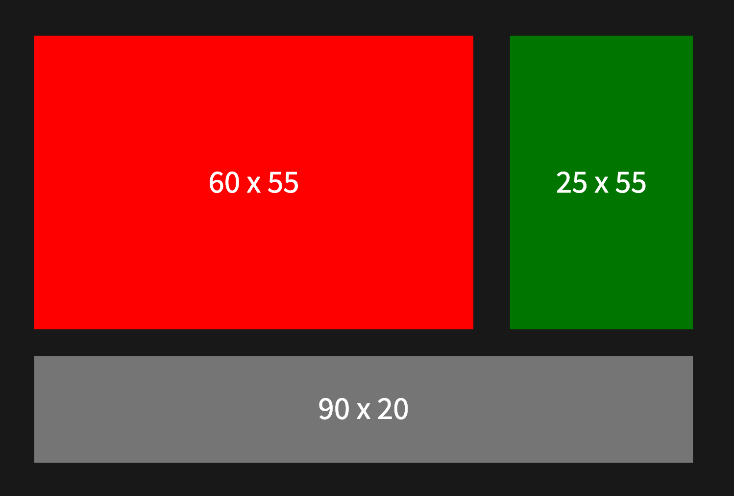
The following sample slide helps to clarify these concepts:
<grid drag="60 55" drop="5 10" bg="red">
60 x 55
</grid>

<grid drag="25 55" drop="-5 10" style=bg="green">
25 x 55
</grid>

<grid drag="90 20" drop="5 -10" bg="gray">
90  x 20
</grid>
Position by Name
Some common grid positions have been named for your convenience. Named positions can be used in place of x and y coordinates on the drop property. The following named positions are currently defined:
- center
- top
- bottom
- left
- right
- topleft
- topright
- bottomleft
- bottomright
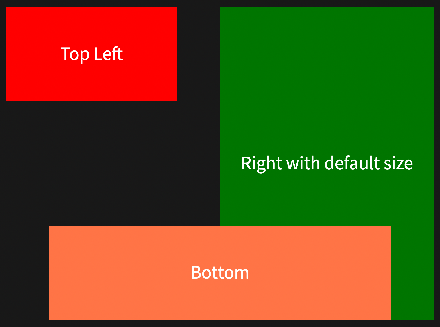
The following sample slide helps to clarify these concepts:
<grid drag="40 30" drop="topleft" bg="red">
Top Left
</grid>

<grid drop="right" bg="green">
Right with default size
</grid>

<grid drag="80 30" drop="bottom" bg="coral">
Bottom
</grid>
Flow
The following syntax is used to define a custom flow for a grid:
<grid drag="width height" drop="x y" flow="col | row">
Using a value of col or row for the flow property defines the layout behavior for the grid. If the flow property is not specified then the grid automatically inherits the default col flow behavior.
Column Flow
When flow="col" the following layout and spacing behaviors occur within the grid:
- Children are rendered vertically within the grid
- An equal amount of space is injected between each child
- An equal amount of space is injected at the start and end of the grid
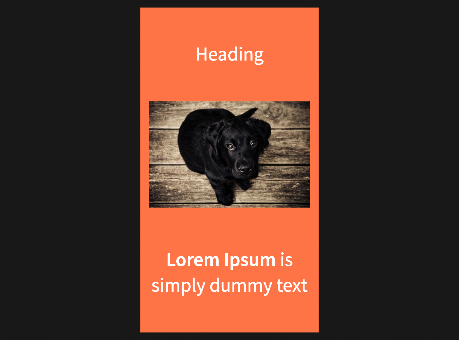
The following sample slide helps to clarify these concepts:
<grid  drag="40 100" drop="center" bg="coral" flow="col">
Heading
![[Image.jpg]]
**Lorem Ipsum** is simply dummy text
</grid>
Row Flow
When flow=row the following layout and spacing behaviors occur within the grid:
- Children are rendered horizontally within the grid.
- An equal amount of space is injected between each child
- An equal amount of space is injected at the start and end of the grid
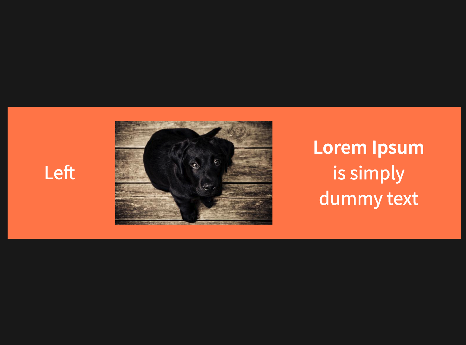
The following sample slide helps to clarify this concept. Note, the grid width here is 100% of the slide width:
The following sample slide helps to clarify these concepts:
<grid  drag="100 40" drop="center" bg="coral" flow="row">
Left
![[Image.jpg]]
**Lorem Ipsum** is simply dummy text
</grid>
Attributes
Background
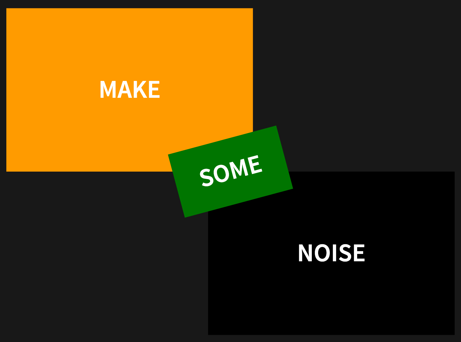
The grid bg property is used to define a custom background for a grid. Children added to the grid are rendered on top of the background.
<grid drag="width height" drop="x y" bg="color">
Where the color option of the bg property takes any valid CSS Color Value. The following sample demonstrates color backgrounds:
<grid  drag="55 50" drop="topleft" bg="orange">
### Make
</grid>

### Noise <!-- element drag="55 50" drop="bottomright" bg="rgb(0,0,0)"-->

<grid  drag="25 20" drop="center" bg="green" rotate="-15">
### some
</grid>
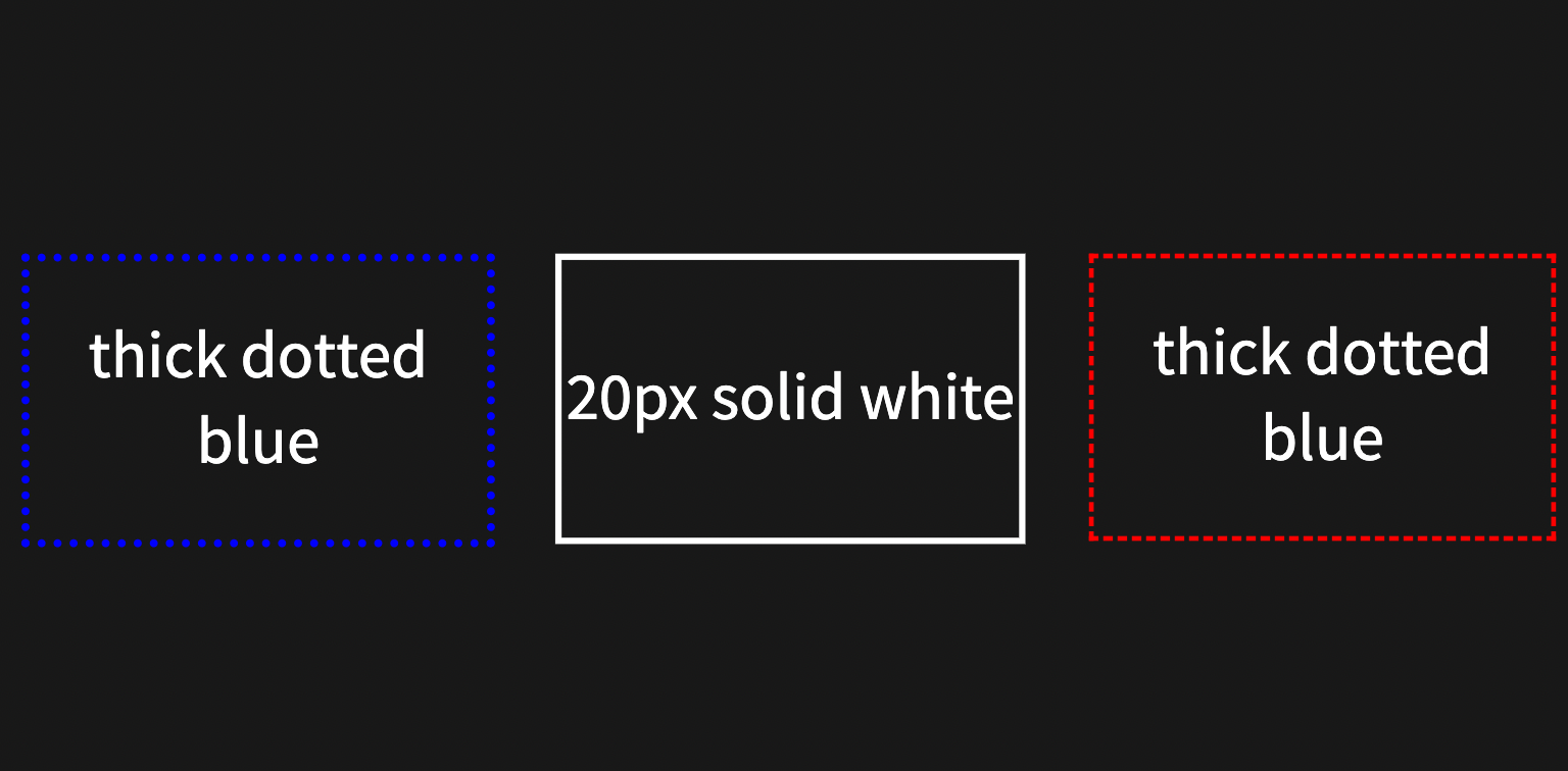
Border
The grid border property is used to define a custom border for a grid section. Custom borders can help to highlight or differentiate grids on your slide.
<grid drag="width height" drop="x y" border="width style color">
Where the width option of the border property takes values of thin, medium, thick or a pixel value such as 10px. The style option takes values of dotted, solid, dashed, inset, or outset. And the color option takes any valid CSS Color Value.
The following sample demonstrates borders:
<grid  drag="30 25" drop="left" border="thick dotted blue">
thick dotted blue
</grid>

<grid  drag="30 25" drop="center" border="4px solid white">
20px solid white
</grid>

thick dotted blue <!-- element drag="30 25" drop="right" border="medium dashed red"-->
Animation
The grid animate property is used to define a slide animation a grid section. The animation applies to the grid and all associated children.
<grid drag="width height" drop="x y" animate="type speed">
Where the type option of the animate property can take one of the following animation types:
- fadeIn
- fadeOut
- slideRightIn
- slideLeftIn
- slideUpIn
- slideDownIn
- slideRightOut
- slideLeftOut
- slideUpOut
- slideDownOut
- scaleUp
- scaleUpOut
- scaleDown
- scaleDownOut
Opacity
The grid opacity property is used to control the transparency of a grid section. Adjusting the opacity of a section also affects the opacity of all associated children.
<grid drag="width height" drop="x y" opacity="level">
Where the level option of the opacity property can take any value from 0.0 to 1.0. A grid section with an opacity value of 0.0 is invisible.
Filter
The grid filter property is used to define filter effects for a grid section. Filter effects on a grid section also affect all associated children.
<grid drag="width height" drop="x y" filter="effect">
Where the effect option of the filter property can take one of the following types:
- blur
- bright
- contrast
- grayscale
- hue
- invert
- saturate
- sepia
The following sample demonstrates filters:
<grid  drag="50 50" drop="-12 -25" bg="white" filter="grayscale()">
![[Image.jpg]]
</grid>

Text is too blurry <!-- element drag="30 25" drop="5 15" bg="#B565A7" filter="blur(10px)" -->

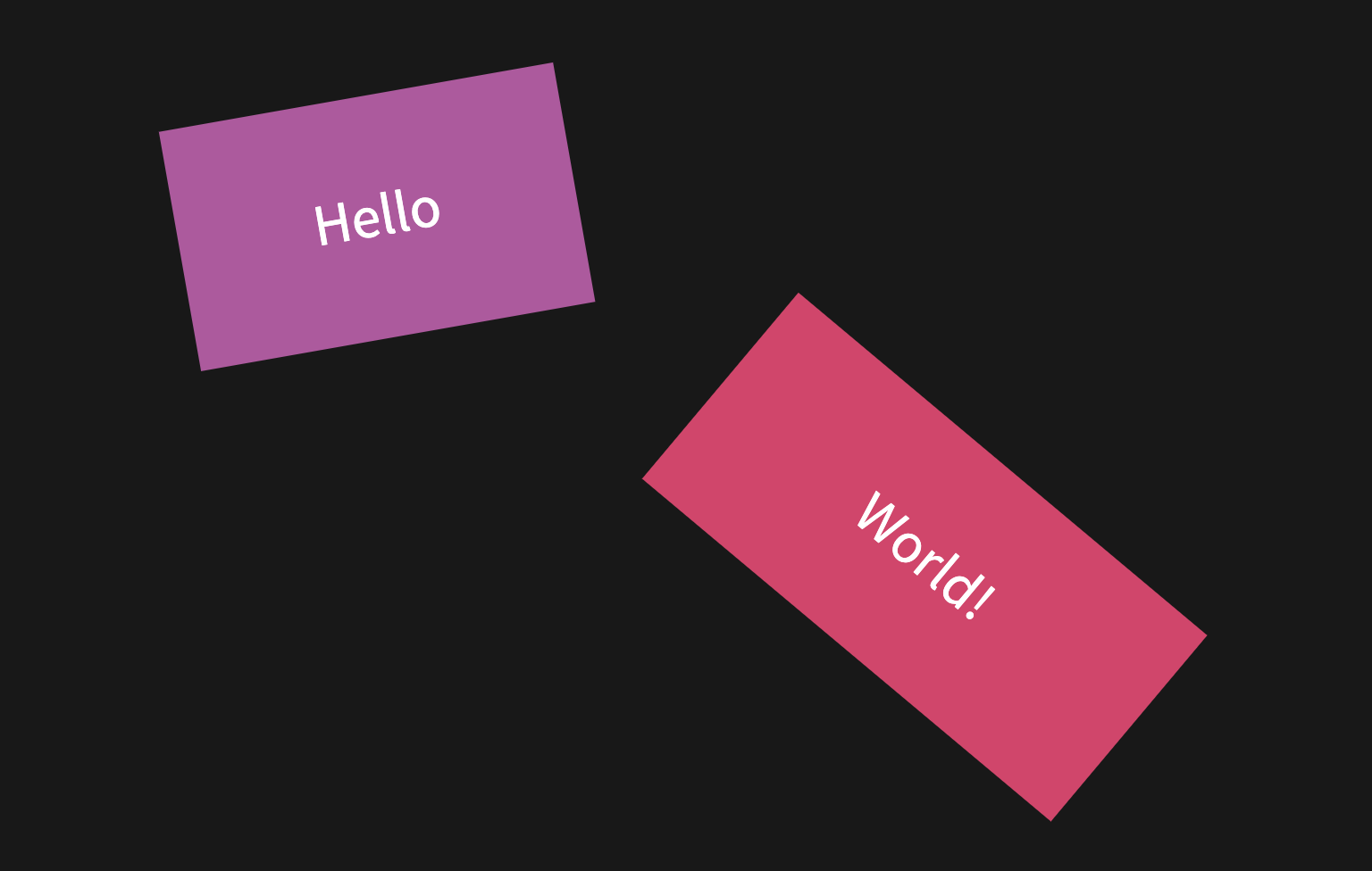
Rotate
The grid rotate property is used to control the 2D rotation of a grid section. Rotation on a grid section also affect all associated children.
<grid drag="width height" drop="x y" rotate="deg">
Where the deg option of the rotate property is a postive or negative value indicates a degree of rotation from 0 to 360 degrees.
The following sample demonstrates rotation:
<grid  drag="30 25" drop="12 15" bg="#B565A7" rotate="-10">
Hello
</grid>

World! <!-- element drag="40 25" drop="-12 -25" bg="#D65076" rotate="40" -->
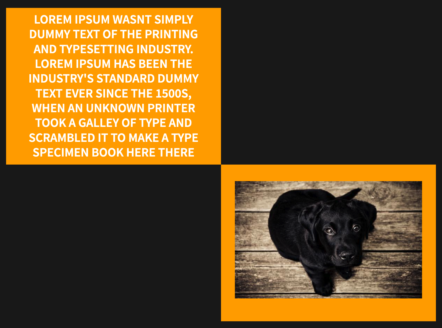
Padding
The grid pad property is used to define custom padding for grid. Custom padding can help to enhance the overall appearance of content by controlling the space around grid children.
<grid drag="width height" drop="x y" pad="top right bottom left">
Where the top, right, bottom, and left options on the pad property all take pixel size values. Following standard CSS Padding Rules these four options can also be specified with just two values or even a single value, for example:
<grid drag="width height" drop="x y" pad="10px 15px">
This sample grid above would display with 10px padding top and bottom and 15px padding left and right. The following sample demonstrates padding:
<grid  drag="50 50" drop="topleft" bg="orange" pad="0 50px">
###### Lorem Ipsum wasnt simply dummy text of the printing and typesetting industry. Lorem Ipsum has been the industry's standard dummy text ever since the 1500s, when an unknown printer took a galley of type and scrambled it to make a type specimen book here there
</grid>

<grid  drag="50 50" drop="bottomright" bg="orange" pad="20px">
![[Image.jpg|800]]
</grid>
Alignment
The grid align property is used to define the horizontal alignment of a grid section.
<grid drag="width height" drop="x y" align="type">
Where the type option of the align property can take one of the following types:
- left
- right
- center (default)
- justify / block
- top
- bottom
- topleft
- topright
- bottomleft
- bottomright
- stretch
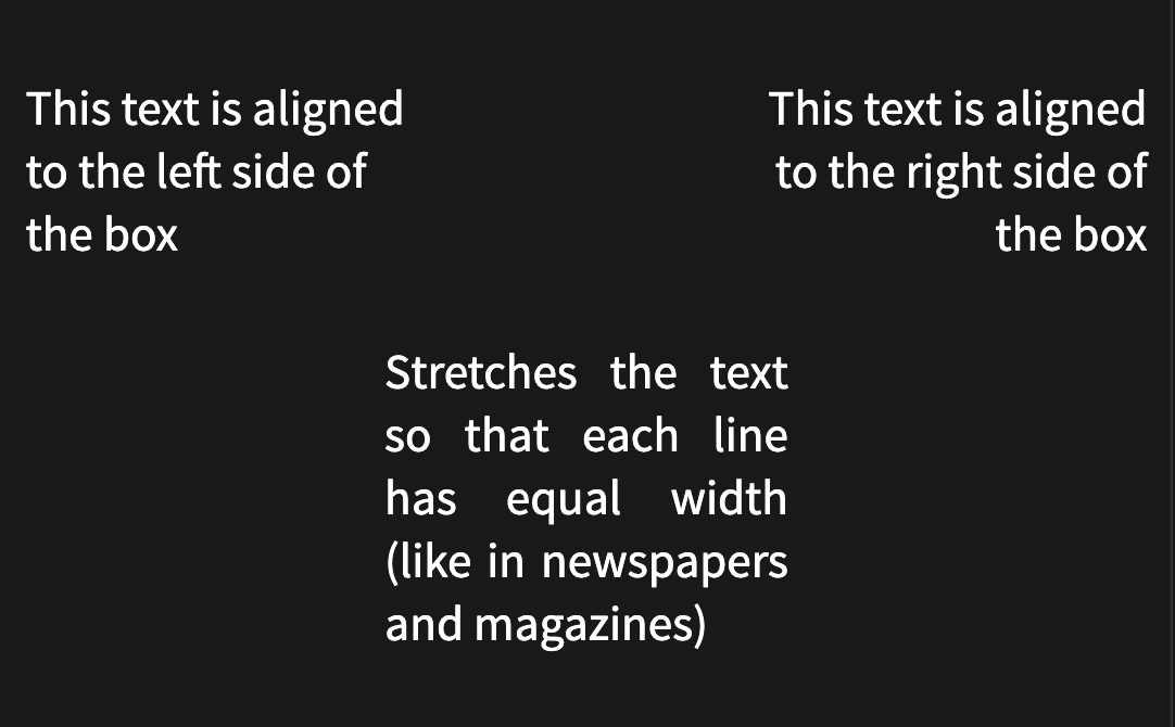
The following sample demonstrates the use of align:
<grid drag="35 20" drop="topleft" align="left">
This text is aligned to the left side of the box
</grid>

<grid drag="35 20" drop="topright" align="right">
This text is aligned to the right side of the box
</grid>

<grid drag="36 20" drop="center" align="justify">
Stretches the text so that each line has equal width (like in newspapers and magazines)
</grid>
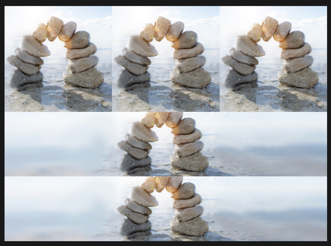
The following sample demonstrates the use of stretch alignment:
<grid drag="100 45" drop="top" flow="row" align="stretch">
![[Title-Wide.png]]
![[Title-Wide.png]]
![[Title-Wide.png]]
</grid>

<grid drag="100 55" drop="bottom" flow="col" align="stretch">
![[Title-Wide.png]]
![[Title-Wide.png]]
</grid>
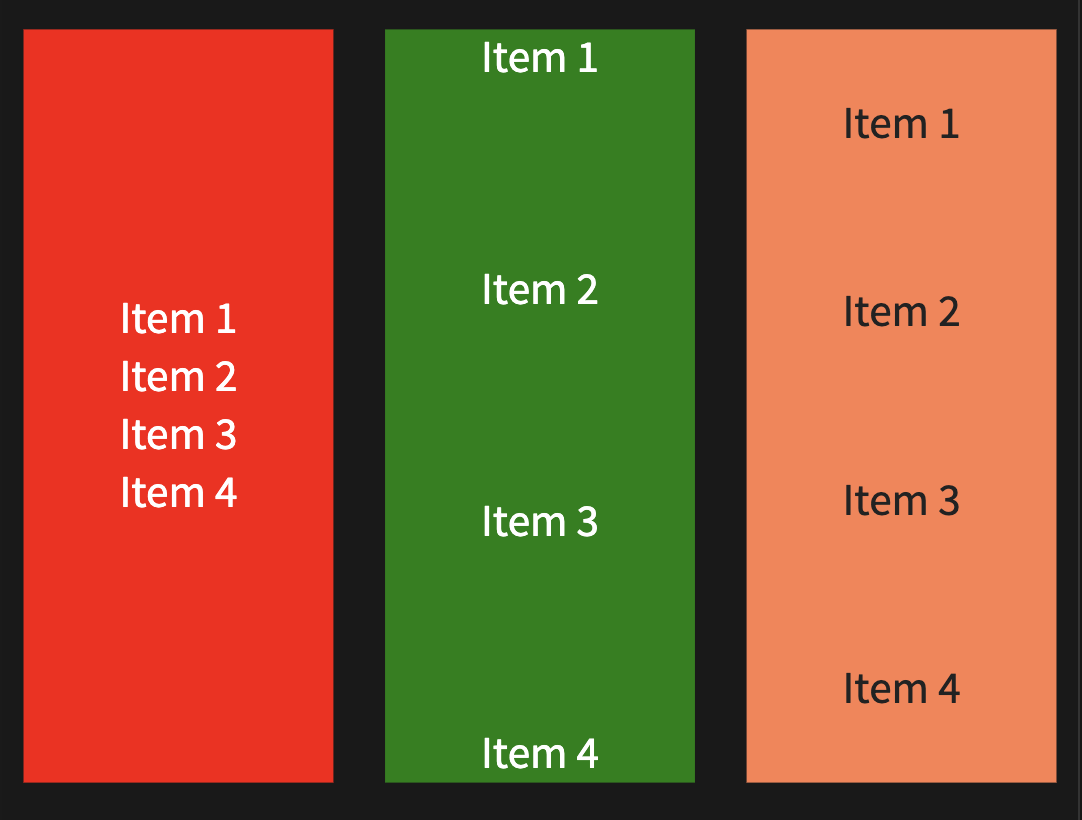
Justify Content
The grid justify-content property is used to define how the grid component distributes space between and around their children.
<grid drag="width height" drop="x y" justify-content="type">
Where the type option of the justify-content property can take one of the following types:
- start
- center
- space-between
- space-around
- space-evenly (default)
- end
The following sample demonstrates the use of align:
<grid drag="30 100" drop="left" justify-content="center" bg="red">
Item 1

Item 2

Item 3

Item 4
</grid>

<grid drag="30 100" drop="center" justify-content="space-between" bg="green">
Item 1

Item 2

Item 3

Item 4
</grid>

<grid drag="30 100" drop="right" justify-content="space-around" bg="coral">
Item 1

Item 2

Item 3

Item 4
</grid>
Fragments
The grid frag property is used to define fragments for grid. Fragments are used to highlight or incrementally reveal individual elements on a slide.
<grid drag="width height" drop="x y" frag="index">
Where the index option of the frag property is a postive value indicates the order the fragment will be displayed.
The following sample demonstrates fragments:
<grid drag="60 55" drop="5 10" bg="red">
### Fragments:
+ Right
+ Bottom
</grid>

<grid drag="25 55" drop="-5 10" bg="green" frag="1">
Right Grid
</grid>

<grid drag="90 20" drop="5 -10" bg="gray" frag="2">
Bottom Grid
</grid>
As you have surely seen in the example, you can combine Fragments and Fragment Lists with each other. By default, Fragment Lists generate indexes that start at 1.
Reference
This guide provides a quick reference to the full set of attributes that can be set on grid component:
- drag=“width height”
- drop=“x y | topleft | top | topright | left | center | right | bottomleft | bottom | bottomright”
- flow=“col | row”
- bg=“color name | #425232 | rgb(255, 99, 71) | hsl(0, 100%, 50%)”
- pad=“all sides | vertical horizontal | top right bottom left”
- align=“left | right | center | justify | block | top | bottom | topleft | topright | bottomleft | bottomright | stretch”
- border=“width style color”
- animate=“fadeIn | fadeOut | slideRightIn | slideLeftIn | slideUpIn | slideDownIn | slideRightOut | slideLeftOut | slideUpOut | slideDownOut | scaleUp | scaleUpOut | scaleDown | scaleDownOut | slower | faster”
- opacity=“0.1…1”
- rotate=“0…360”
- filter=“blur | bright | contrast | grayscale | hue | invert | saturate | sepia”
- frag=“1”
- style="<any>"
- class="<any>"